Day 17/100 in #100DaysOfDesign: Demystifying Typography: A Handy Cheat Sheet
(Why) - The Art and Science of Typography ✍️ On Day 17 of my #100DaysOfDesign journey, we dive deep into the world of typography. Typography isn't just about choosing pretty fonts; it's the art and science of arranging text in a way that's not only v...
(Why) - The Art and Science of Typography
✍️ On Day 17 of my #100DaysOfDesign journey, we dive deep into the world of typography. Typography isn't just about choosing pretty fonts; it's the art and science of arranging text in a way that's not only visually appealing but also highly readable and effective.
(What) - Unlocking Typography Terms
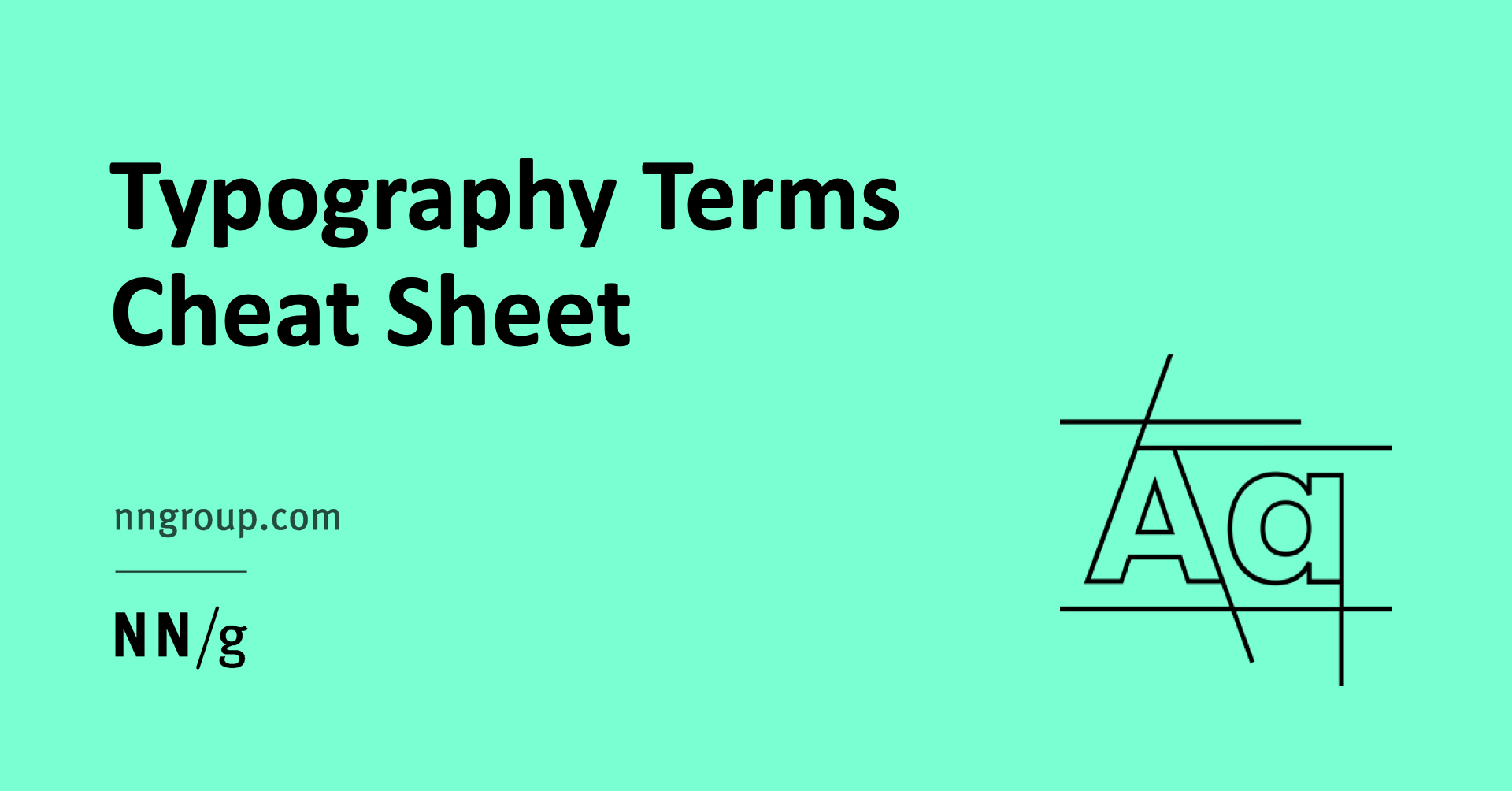
✍️ To navigate this world, I turn to the insightful resource by Nielsen Norman Group: Typography Terms for UX Designers: A Glossary. This comprehensive glossary demystifies typography terms that are essential in the realm of web design and CSS, including:
Kerning: Adjusting the space between individual characters.
Baseline: The invisible line upon which most characters "sit."
Serif: Typefaces with decorative lines at the ends of characters.
Sans-serif: Typefaces without those decorative lines.
Leading: The vertical space between lines of text.
Widows and Orphans: Terms related to the last line of a paragraph spilling over to the next page.
Tracking: Adjusting overall spacing between characters.
X-Height: The height of lowercase letters without ascenders or descenders.
Hierarchy: Using different sizes, weights, and styles to create visual contrast and emphasize certain text.
Ligature: The combination of two or more characters into a single character for improved readability.
Understanding these terms is like having a secret key to better design, especially when dealing with CSS for web design.
For practical insights, I also found an article about creating a typography system in Figma: Creating a Typography System in Figma, which offers valuable guidance on implementing typography in design.
(How) - Applying Typography Know-How
🖼️ The world of web design relies heavily on CSS, and these typography terms are not just jargon; they are the building blocks of text presentation. Understanding them can be the difference between a cluttered, unreadable webpage and one that draws users in and guides them seamlessly through content.
(Why It Matters) - Typography's Impact on User Experience
🌟 Typography plays a profound role in shaping the user experience. It affects not just the aesthetics of a design but also the readability and comprehension of the content. Whether it's a website, app, or any digital product, mastering typography is a crucial step toward creating designs that resonate with users.
As I continue on this design journey, I'll be leaning on this typography cheat sheet to ensure that every piece of text I present is not just visually pleasing but also user-centric.